How to design the perfect UI button. A guide to usability, aesthetics, and Interaction
How to design the perfect UI button. A guide to usability, aesthetics, and Interaction
Mar 4, 2025
Mar 4, 2025
Buttons are one of the most essential elements in UI design. They serve as the primary means of interaction between users and digital products. A well-designed button enhances usability, improves accessibility, and contributes to a seamless user experience. While buttons may seem like simple elements, their design requires careful consideration of size, color, contrast, labeling, and interaction states.
In Details
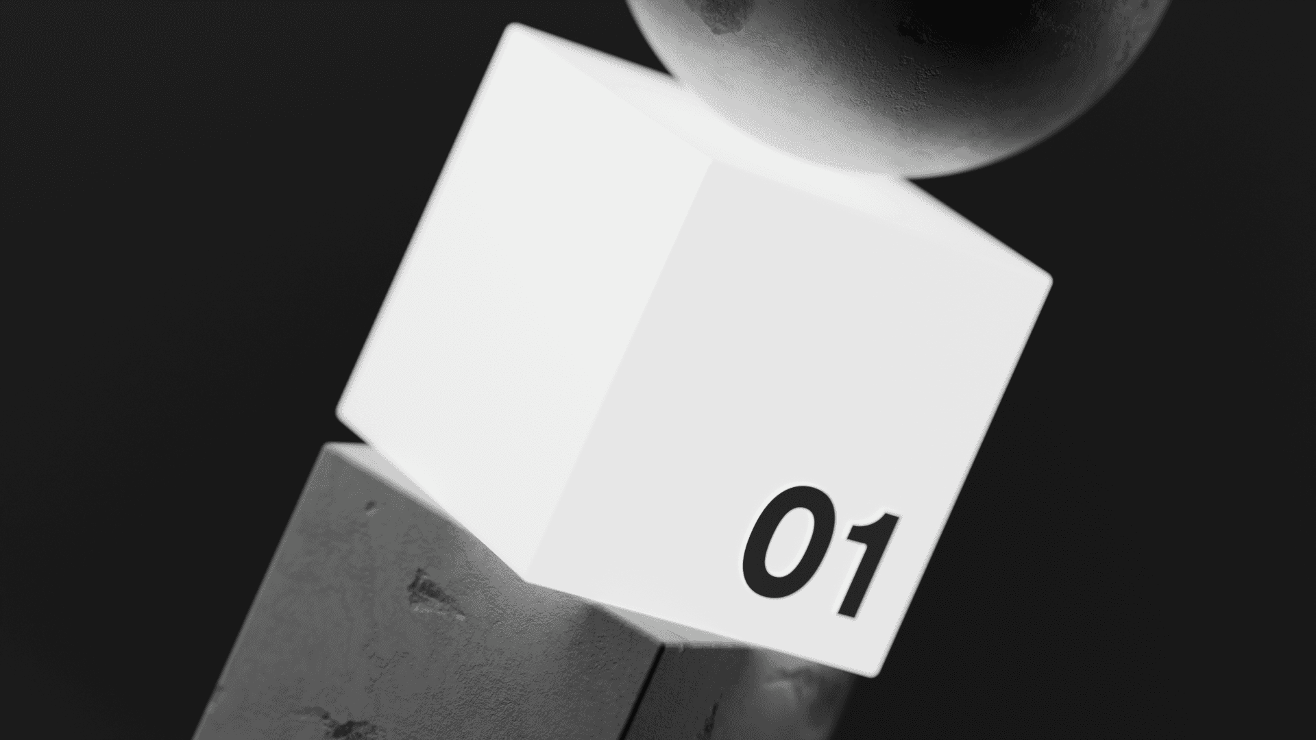
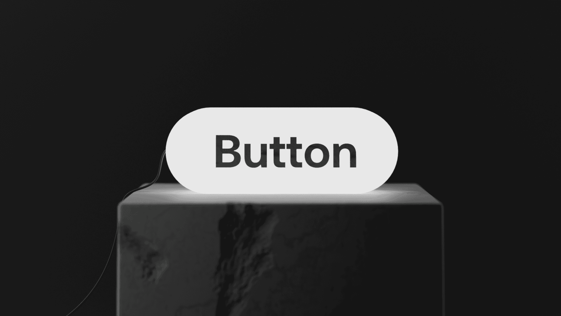
A button should be large enough to be easily tappable or clickable. Standard touch targets are around 44x44 px (Apple) and 48x48 px (Google), ensuring users can interact with them effortlessly. Rounded corners or pill-shaped buttons often feel more inviting and modern, making them a preferred choice in many UI designs. The shape and padding should complement the surrounding elements to create a balanced visual flow.
Color and contrast play a significant role in making buttons noticeable. A button should stand out from the background while still aligning with the overall brand identity. High contrast ensures visibility, and different states like hover, active, and disabled should be easily distinguishable. Using subtle gradients, shadows, or borders can add depth and make the button feel more tactile.
Text labels should be clear, concise, and action-oriented. Instead of using vague terms like "Click Here," opt for strong, direct calls to action such as "Get Started," "Sign Up," or "Download." Typography also matters—choosing a readable font with appropriate spacing ensures clarity and usability across different screen sizes.
Hierarchy and placement influence how users interact with buttons. Primary buttons should stand out the most, guiding users toward key actions, while secondary and tertiary buttons should be more subtle. Proper spacing and alignment ensure that buttons feel natural within the overall UI layout. The button’s placement should be intuitive, typically positioned where users expect them, such as at the end of a form or in a navigation bar.
Microinteractions and feedback add life to buttons. Hover effects, subtle animations, and click states indicate interactivity and improve user engagement. A slight bounce or fade effect upon clicking can make buttons feel more responsive. These small details contribute to a polished and satisfying user experience.
Accessibility is crucial in button design. Buttons should be navigable via keyboard (tabbing), have sufficient color contrast, and include aria-labels for screen readers. Ensuring that all users, including those with disabilities, can interact with buttons effectively enhances usability and broadens audience reach.
Maintaining consistency in button styles across an app or website establishes a cohesive design language. Defining button styles—such as primary, secondary, and ghost buttons—and documenting them in a design system ensures uniformity. Consistent use of colors, shapes, padding, and interactions reinforces a strong brand identity.
A well-designed button might seem like a small detail, but it significantly impacts user experience. Thoughtful button design ensures that users can interact with interfaces effortlessly, making digital experiences more enjoyable and efficient. By considering these principles, you can craft buttons that not only look great but also enhance usability and accessibility.
Now go create buttons that users love to click!
Buttons are one of the most essential elements in UI design. They serve as the primary means of interaction between users and digital products. A well-designed button enhances usability, improves accessibility, and contributes to a seamless user experience. While buttons may seem like simple elements, their design requires careful consideration of size, color, contrast, labeling, and interaction states.
In Details
A button should be large enough to be easily tappable or clickable. Standard touch targets are around 44x44 px (Apple) and 48x48 px (Google), ensuring users can interact with them effortlessly. Rounded corners or pill-shaped buttons often feel more inviting and modern, making them a preferred choice in many UI designs. The shape and padding should complement the surrounding elements to create a balanced visual flow.
Color and contrast play a significant role in making buttons noticeable. A button should stand out from the background while still aligning with the overall brand identity. High contrast ensures visibility, and different states like hover, active, and disabled should be easily distinguishable. Using subtle gradients, shadows, or borders can add depth and make the button feel more tactile.
Text labels should be clear, concise, and action-oriented. Instead of using vague terms like "Click Here," opt for strong, direct calls to action such as "Get Started," "Sign Up," or "Download." Typography also matters—choosing a readable font with appropriate spacing ensures clarity and usability across different screen sizes.
Hierarchy and placement influence how users interact with buttons. Primary buttons should stand out the most, guiding users toward key actions, while secondary and tertiary buttons should be more subtle. Proper spacing and alignment ensure that buttons feel natural within the overall UI layout. The button’s placement should be intuitive, typically positioned where users expect them, such as at the end of a form or in a navigation bar.
Microinteractions and feedback add life to buttons. Hover effects, subtle animations, and click states indicate interactivity and improve user engagement. A slight bounce or fade effect upon clicking can make buttons feel more responsive. These small details contribute to a polished and satisfying user experience.
Accessibility is crucial in button design. Buttons should be navigable via keyboard (tabbing), have sufficient color contrast, and include aria-labels for screen readers. Ensuring that all users, including those with disabilities, can interact with buttons effectively enhances usability and broadens audience reach.
Maintaining consistency in button styles across an app or website establishes a cohesive design language. Defining button styles—such as primary, secondary, and ghost buttons—and documenting them in a design system ensures uniformity. Consistent use of colors, shapes, padding, and interactions reinforces a strong brand identity.
A well-designed button might seem like a small detail, but it significantly impacts user experience. Thoughtful button design ensures that users can interact with interfaces effortlessly, making digital experiences more enjoyable and efficient. By considering these principles, you can craft buttons that not only look great but also enhance usability and accessibility.
Now go create buttons that users love to click!